How Can We Help?
(B) Charts at top of page and functions
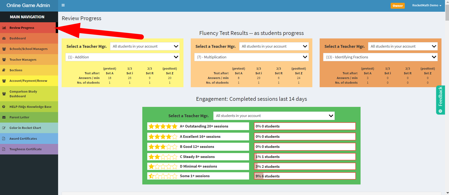
The Review Progress tab is at the top of the main rainbow navigation. While student are playing, you can see how they are progressing without looking over their shoulder. After students have begun playing, Review Progress will become the default screen.
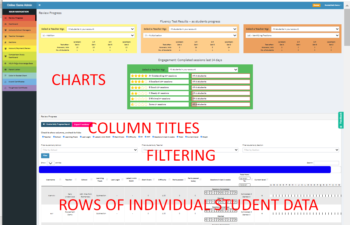
Orientation to the Review Progress tab. There’s a lot of data here for you to see. We will cover all of this. At the top are the charts of fluency test results and engagement. At the bottom are the rows of individual student data in gray and white. That student data comes in columns and the column titles are there in the middle so you can hide some columns of data if you wish. Then comes the filtering boxes which allow you to filter for specific schools, teachers or sections of student data. Let’s begin with the charts.
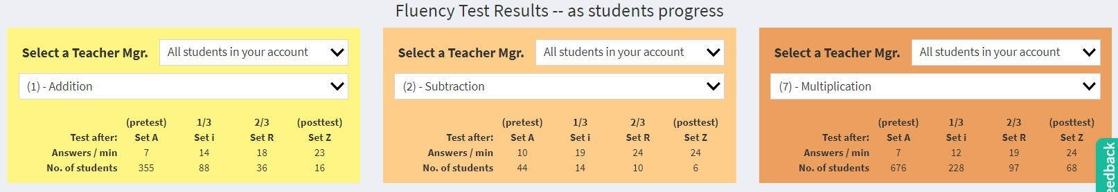
Fluency Test Results. At the top of the Review Progress tab are three charts with Fluency test results. After all, the purpose of Rocket Math is to develop fluency with math facts.
The Online Game tests for fact fluency in each Learning Track four times in their A to Z journey. As a pre-test after Set A, then 1/3 of the way through the Learning Track after Set i, then 2/3 of the way through on Set R, and as a posttest after finishing Set Z of the Learning Track. You can set these Fluency Tests charts to whichever Learning Track or teacher you are most interested in knowing about. They will stay on your chosen data until you switch them.
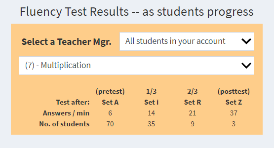
A closeup of Fluency Test results. These test results show both the number of students to reach each of these milestones as well as giving you their average fluency in correctly answered facts in one minute from those tests. As you can see from the data from this school the students grew in fluency from an average of 6 problems per minute after Set A to 37 in a minute after Set Z. So clear evidence of improved fluency.
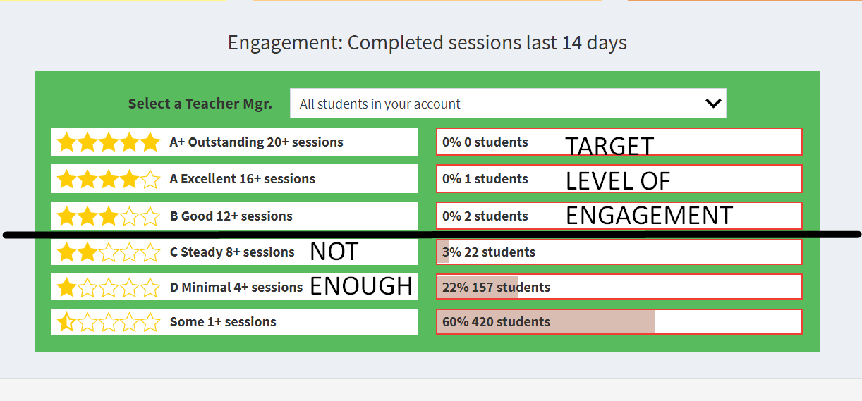
The other prominent chart is the Engagement chart which looks at COMPLETED sessions in the last 14 days. Sessions are by default 5 minutes but can be raised for older students to 10 or even 15 minutes in length. The chart shows the number of students (and the percentage of your school or class they represent) reaching each of six levels of engagement. Requiring daily sessions in school is the starting point. Completing one session per day at school would be 10 sessions. Less than that is not really enough to be learning well. We recognize some engagement by giving up to 2 ½ stars to students who are doing less than that, but you want to strive to get most of your students above that 10 session level in the last 14 days. If you simply had students do one session in school and one more at home for homework that would be 20 sessions in the last 14 days and that would merit five stars in our book!
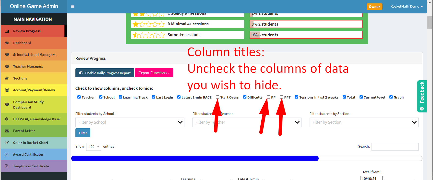
There more than a dozen columns of data here. The column titles are listed at the top of the page of individual student data. The username column stays, but any of the rest can be hidden or displayed. The ones with a blue check mark have their data showing. For any column you don’t want to see displayed, you can simply “uncheck” it and it will become hidden. In this example the number of start-overs, the parts passed (PP) and the parts passed today (PPT) are unchecked and therefore hidden. By the way, that bright blue slider allows you to scroll over to see data in columns that might be showing on your screen
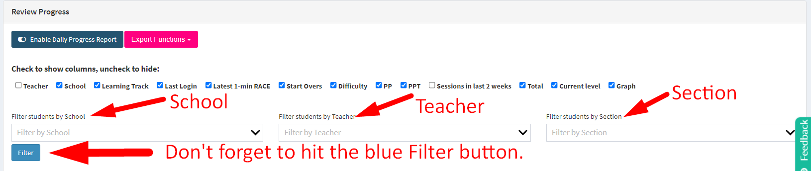
Filter functions are available for you to filter the individual student data display down below. If you have the categories of schools, or teachers, or sections in your account you can use these filters to see only the category you are interested in. After you choose the category for which you want to filter be sure to hit the blue “Filter” button. I’m always forgetting that step!
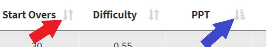
Columns–Click arrows to sort the data. It’s important to know that all these columns of student data are sortable. There are tiny gray arrows next to the title of each column. You can click them to sort the data (and the students) sorted down—with the largest value at the bottom or sorted up—starting with the largest values up at the top. See the blue arrow pointing to the tiny stack of boxes next to the PPT column? The gray arrow and the stack show that this column is sorted down with the values getting larger as you go down. This can be very helpful so you can find the students who are working the hardest, or who are having the most difficulty, or who haven’t logged in recently.